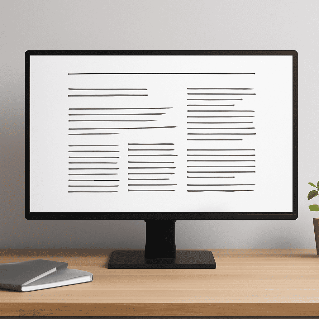
In the dynamic realm of digital interfaces, the subtle art of typography holds a powerful place. The careful selection and arrangement of fonts can significantly enhance user interaction, guiding their focus and improving their navigation experience. Delving into typography within digital design unveils strategies to amplify both readability and visual hierarchy, making for an engaging exploration.
Font Selection and Readability
Choosing the right typeface is pivotal. Serif fonts, known for their small decorative strokes at the ends of letters, evoke a sense of tradition and reliability, making them suitable for more serious or formal sites. On the other hand, sans-serif fonts, characterized by their clean lines, help create a modern and minimalistic feel. The choice between these styles depends on the atmosphere you wish to convey.
Ensuring text readability is crucial as well. Fonts must be legible across various devices and screen sizes. An optimal font size strikes a balance between aesthetic appeal and practical usability, generally falling within the range of 16 to 20 pixels for body text. Additionally, maintaining a healthy contrast between the text and background enhances readability, with larger texts having slightly less contrast to ease the eyes.
Line Height and Spacing
The arrangement of text influences its visual appearance and reader comprehension. Appropriate line height, typically ranging from 1.4 to 1.6 times the font size, prevents text from appearing cramped, thereby supporting readability. This spacing also provides a visual pause, allowing users to absorb content more conveniently.
Letter-spacing, or tracking, also plays a role in the clarity of text presentation. Default settings often suffice, but slight adjustments can improve readability, particularly in uppercase text or larger headers, ensuring that individual letters stand out distinctly.
Establishing a Visual Hierarchy
The visual hierarchy guides users through content logically, emphasizing crucial information and effortlessly navigating them through a page. Using a combination of different font sizes, weights, and styles effectively communicates this hierarchy. Larger, bolder fonts naturally draw attention, making them suitable for headers or crucial information points.
Subheads and body text typically use progressively smaller and lighter fonts, establishing a clear pathway for the eye to follow. Utilizing italics or varying weights within a font family reinforces this hierarchy without disrupting the design’s cohesive look.
Improving User Engagement through Typography
Typography isn't solely about aesthetics; it can also enhance user engagement. Animated text or dynamic changes in typography as users scroll can add an interactive dimension to an interface. Subtle transitions can direct attention to key areas, offering users a more immersive experience.
Additionally, consistent typography usage across different sections fosters a sense of familiarity and ease, empowering users to predict where specific information or actions are likely to be found.
The Future of Typography in Digital Design
As digital landscapes evolve, typography continuously adapts. Variable fonts, which allow for a broad range of style variations within a single file, are an emerging trend. These provide designers with extensive flexibility to modify the weight, width, and other attributes dynamically, optimizing both performance and design innovation.
Moreover, integrating responsive typography ensures text remains readable on all devices. Techniques like media queries and CSS clamp functions adjust font size based on screen size, facilitating smooth transitions and consistent user experiences.
In summary, typography in digital environments extends beyond mere decoration; it's a critical aspect of design that enhances functionality and communication. Through thoughtful font selection and strategic arrangement, typography not only improves readability but also establishes a clear visual hierarchy, leading to a richer and more engaging interaction for users. As technology progresses, embracing new typographic possibilities will continue to shape the future of digital design.