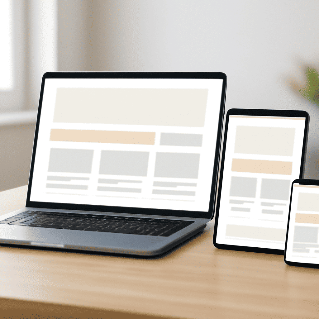
In the digital age, ensuring that online content is accessible and engaging on any device is critical. As technology continues to evolve, users interact with the internet through a myriad of devices, including smartphones, tablets, laptops, and desktops. This diversity in screen sizes and resolutions makes a flexible design approach essential to delivering an optimal user experience across different platforms.
Creating designs that adjust gracefully to various screen sizes involves a few key principles and techniques. At the core of this adaptability is the utilization of flexible grids and layouts. Instead of relying on fixed dimensions, designers use relative units like percentages to create frameworks that automatically resize themselves in relation to the browser or device window. This ensures that the layout looks good and functions well on any screen.
In addition to flexible grids, media queries play a pivotal role in a flexible design. Media queries are a feature of CSS that allow developers to specify styles for different screen conditions. By setting breakpoints—specific device widths at which certain CSS styles are applied—designers can tweak how content is displayed to best fit the screen, whether it’s hiding navigation menus behind a hamburger icon on mobile or enlarging buttons for easier tapping.
Another crucial element in adaptable design is responsive images. As images are often the largest files on a page, serving appropriately sized images for different screen resolutions is important for performance. The HTML srcset attribute, along with the sizes attribute, enables the browser to choose the right image sources based on the screen’s resolution and size.
Typography also needs to be flexible so it's easily readable on any device. Using responsive typography units such as 'em' or 'rem' allows text to scale based on the user's settings, making content more accessible.
Apart from technical aspects, understanding user behavior and design principles is vital. Users navigate devices differently, and their goals may change depending on whether they're on a phone or a desktop. Therefore, designing intuitive, seamless experiences that meet users’ needs across all devices requires careful consideration of both functionality and aesthetics.
Moreover, thorough testing is integral to ensuring a smooth experience. Testing the design on multiple devices and browsers can reveal areas needing adjustment. Embracing an iterative process, where feedback is constantly used to improve the design, ensures that the end result is both beautiful and functional.
In conclusion, creating adaptable designs is not just about technical implementation, but also about enhancing accessibility and usability. As users engage with content on various devices, having a strategy that delivers consistent and enjoyable experiences, regardless of the platform, is an essential aspect of modern digital design. Through flexible grids, media queries, responsive images, and thoughtful design choices, one can craft experiences that truly resonate with their audience.